Wednesday, 22 October 2014

Casting

This is heather when i cast her face using clingfilm around her face to protect her and her skin(VERY IMPORTANT) and using modroc and water to cast it..Weve done this before in the past and i loved it then too.Obviously not casting all around the face because then she'd be stuck in there forever..she trusts me enough not to do that..also leaving the nostril area open so she can breathe,obviously..
After the making of the modroc cast,we had then to make the solid block cast with plaster..
What happens is,first of all with some soft soap and a brush,lather the inside of your modroc mask in the soft soap with a few layers until it becomes shiny.This is so the plaster doesnt stick to the modroc mask and so the modroc peels off the plaster easily.
When that is done,before carrying on,make sure you're wearing protection for your clothing as heather demonstrates on the picture above..a face mask covering your mouth and nose because there is a big dust hazard,and gloves if you prefer not to have plaster on your hands.
With a clean working area and a clean bucket,pour water into the bucket only about a quarter full,then add the casting plaster,this is where the dust gets dangerous so make sure youre careful when adding it to your bucket,gently tease it in.
When thats done,start to mix the water and plaster with yours hands slowly,and it will gradually get thicker after a few minutes or so.When it gets to the point of almost like whipped cream,you can then apply it to the inside of the modroc mask,make sure to be quick but not rushed and for this to work the plaster has to be thick around the sides of the mask so it doesnt crack fall to pieces..
When it is dry after a few minutes no more,you can then peel off the modroc carefully,this is what i ended up with..


Body Casting

Artist Research:
Antony Gormley
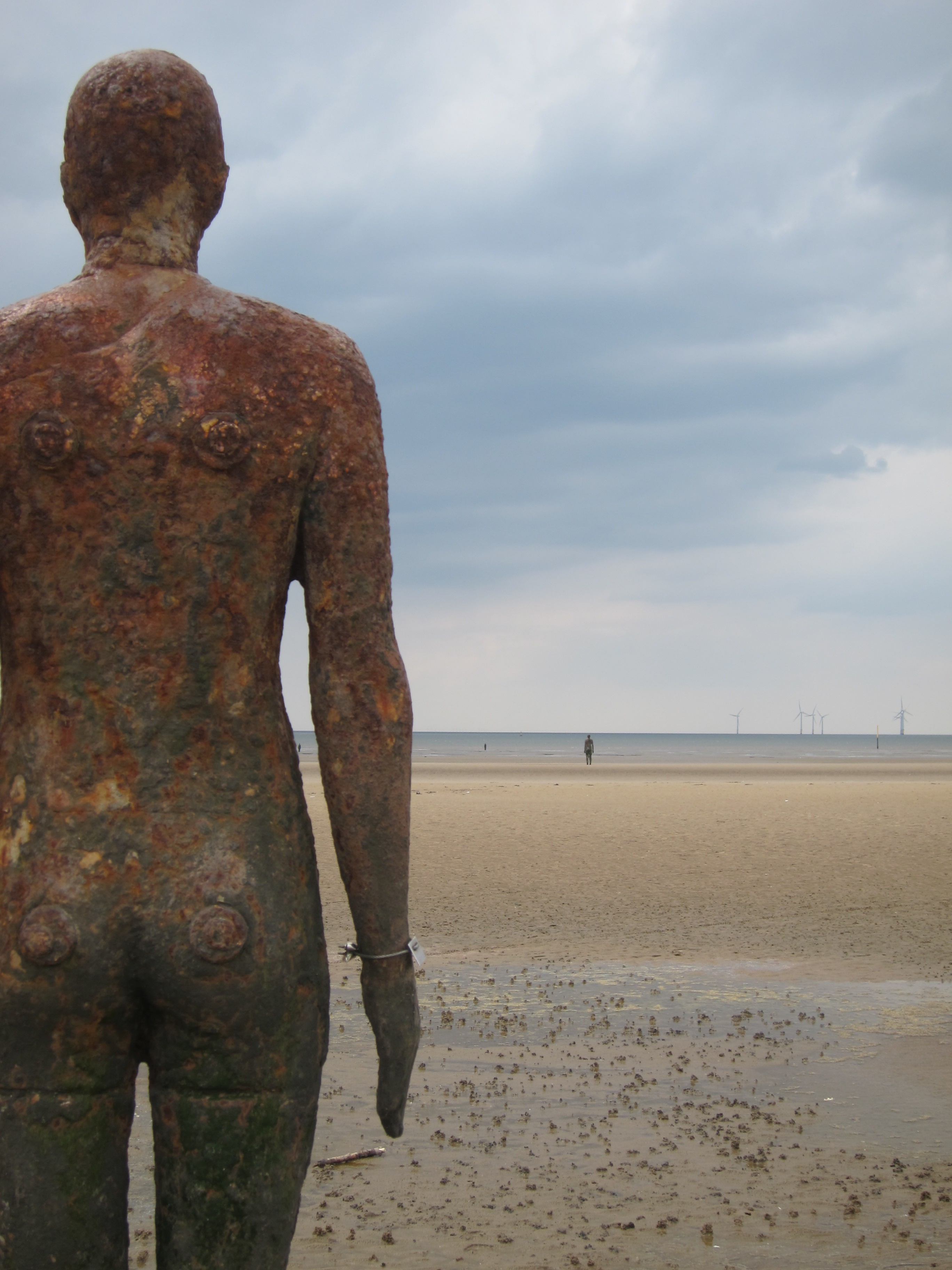
I have looked at Gormleys work before in previous projects and i loved his work.Gormley uses his own body to cast for his work..
George Segal
Segal is a lot different to Gormley in comparison,as Gormley does more simple work as just his body cast in an average shape,still good and intriguing.Where as Segal uses more shapes in the body,more out there with his sculptures,he also casts the clothes on the people and makes them very realistic.each one of his sculptures are in different positions,either natural poses or very odd which makes me favourite segal slightly..


Newspaper

Lorem Ipsum

This is simply gibberish text of the printing and typesetting industry,it has been since the 1500's..Its not just simple random text,it has roots from latin literature from 45 BC.When looking at its layout on a page,the reader will simply be distracted from the readable content.It looks readable because it has a normal distribution of letters..

"Neque porro quisquam est qui dolorem ipsum quia dolor sit amet, consectetur, adipisci velit..."

"There is no one who loves pain itself, who seeks after it and wants to have it, simply because it is pain..."
Lorem ipsum dolor sit amet, consectetur adipiscing elit. Nunc tempus at velit ac tincidunt. Morbi varius, dolor nec vulputate malesuada, quam velit porta massa, id tristique ante neque a ipsum. Mauris at justo non lectus pretium cursus id sit amet felis. Aenean dignissim felis quis turpis tempus, sit amet imperdiet est laoreet. Integer quis quam vitae sem suscipit fringilla. Morbi facilisis egestas hendrerit. Donec ullamcorper tortor a enim varius, ac efficitur magna pulvinar. Etiam in molestie est. Etiam vulputate tincidunt mi, eu gravida odio gravida vitae.
Praesent nec elementum elit, quis vulputate augue. Aenean rhoncus volutpat lacus at tristique. Vivamus mi lacus, interdum sed vehicula at, finibus a dui. Suspendisse tempus nisl id purus pharetra ornare. Fusce non sem quis massa venenatis euismod. Fusce tincidunt egestas magna non consectetur. Lorem ipsum dolor sit amet, consectetur adipiscing elit. Cras volutpat nec nulla in semper.
Nulla ac ipsum a metus dictum porttitor ac blandit neque. Vivamus tincidunt ac velit et dignissim. Nulla nibh odio, maximus eget sapien vel, accumsan tincidunt ante. Duis aliquet laoreet mi a condimentum. Mauris et eros lectus. Nullam sollicitudin ex at leo viverra, sit amet imperdiet eros lacinia. Aenean bibendum dui sed metus varius gravida. Curabitur non elit hendrerit, consequat ipsum a, venenatis dolor.
Nam tristique feugiat finibus. Suspendisse potenti. Pellentesque aliquam varius suscipit. Nam malesuada elit non elementum suscipit. Vivamus sit amet nisi quis sapien lobortis vulputate sit amet et tellus. Nulla augue nunc, iaculis eget arcu id, faucibus fermentum odio. Aliquam nec risus elit. Maecenas pulvinar nisi in arcu aliquet varius. Etiam iaculis, lorem non suscipit laoreet, nulla nisl viverra lectus, rhoncus semper metus tellus non ligula. In posuere et enim sed tincidunt. Pellentesque ornare hendrerit dolor id posuere. Vivamus varius mauris eget pulvinar scelerisque. Aenean id suscipit felis, quis volutpat nibh. Sed vel sapien neque. Ut viverra vitae enim non placerat. Morbi quis urna mi.
Aliquam tellus turpis, consectetur eu fringilla auctor, convallis vitae augue. Pellentesque lacinia et urna eu finibus. Curabitur at urna ut est lobortis pretium eget et sem. Quisque ac magna et turpis pellentesque rutrum vitae in justo. Aenean sit amet blandit ipsum, eu finibus magna. Nullam sed ligula maximus, sollicitudin nulla accumsan, pellentesque libero. Integer fermentum diam venenatis enim condimentum egestas. Aliquam mauris sem, venenatis in accumsan nec, ullamcorper sed erat. Vivamus congue laoreet consequat.


As i was looking through my mums old stuff including all her art work,i came across this newspaper she had saved from years ago when she was in it..I thought it would be great to relate to this project..its a proper old fashioned newspaper from 1981 and i was really intrigued..


composition

Composition is the arrangement of visual elements in a work of art.Another word for it is "putting together" and can be for any kind of art...Basically putting it all together and it can be like symmetry and just making sure it is level and in line with everything.leading the eye through the piece of art..

Rule of thirds
This is a guideline for visual artists and photographers and is thought to be a simplification of the golden mean,which is a ratio that has been used for centuries as a composition..When two things are in the proportion of 1:1:618,they are said to be the golden mean.
Dividing the parts of an image according to this proportion helps to create a pleasing, balanced composition.


Rule of odds 

The "rule of odds" states that by framing the object of interest with an even number of surrounding objects, it becomes more comforting to the eye, thus creates a feeling of ease and pleasure.So its all about deciding on how many elements or items you want in your composition,and making it an odd number creates more of a dynamic piece..
These makes it so that your eye and brain cant pair them up or group it together and keeps your eye moving across the composition..


Rule of Odds in a Painting Composition - Photo ©2010 Marion Boddy-Evans. Licensed to About.com, Inc.In the picute on the left,you can count how many brushes in the pot there are easy...the one on the right,not so easy,but makes more of a better composition in the rule of odds..as it takes you longer to look at it and more interesting in an odd way..the one on the left seems quite boring and uninteresting to look at in some way or another,just because of one slight change it changes the whole concept of the painting..how odd.


Line composition is one of the many elements of deisign in compostition..The visual path that enables the eye to move within the piece..They are also strongly influenced by tone, color, and repetition in relation to the rest of the photograph..
Vertical creates a bold statement  
Horizontal indicates stability but in a much more calming way..
Diagonol creates a sense of energy of motion!..
Organic lines introduce a sense of chaos and complexity..
Curved lines create a sense of flow within the image..
Joe RosenthalJoe rosenthal
                                                               
Huroshi Sugimoto..
Hiroshi SugimotoHiroshi Sugimodo

Charles SheelerCharles sheeler


Robert MapplethorpeRobert Mapplethorpe
 
As I was looking through my mums old art stuff..I came across an intrested frame and I noticed it had lines of composition on it and when I asked her about it she said she used it to see where the balance,lines and symmetry is in a photo or piece of art.. or before she was about to paint..It really interested me and I was very happy and lucky to have found this as we're working on composition at the minute... 
 
I tried it out on some pictures I got up on google images 


making negative a positive


So positive space is simply an object..something solid,you can hold,touch,feel..Negative space is the area around it,the emptyness..

Here is the best way to describe it..

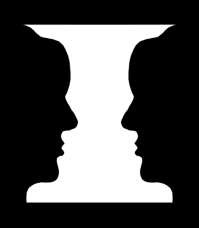
If you are seeing a vase, then you are seeing the white area as the positive space. The black areas become the negative space. If you are seeing faces, then you are seeing the black areas as the positive space, and the white area as the negative space.

Positive and negative space


frankzilla