Wednesday 24 June 2015

Final exhibition

Okay, so my exhibition I started by displaying my images clearly and mounted them up. I planned to have my images, and my designs and maybe  cool background I could paint on the wall. But I had quite abit too much space to just have that it didn't draw people's attention. 
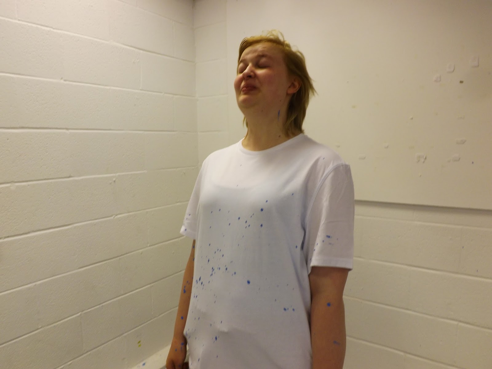
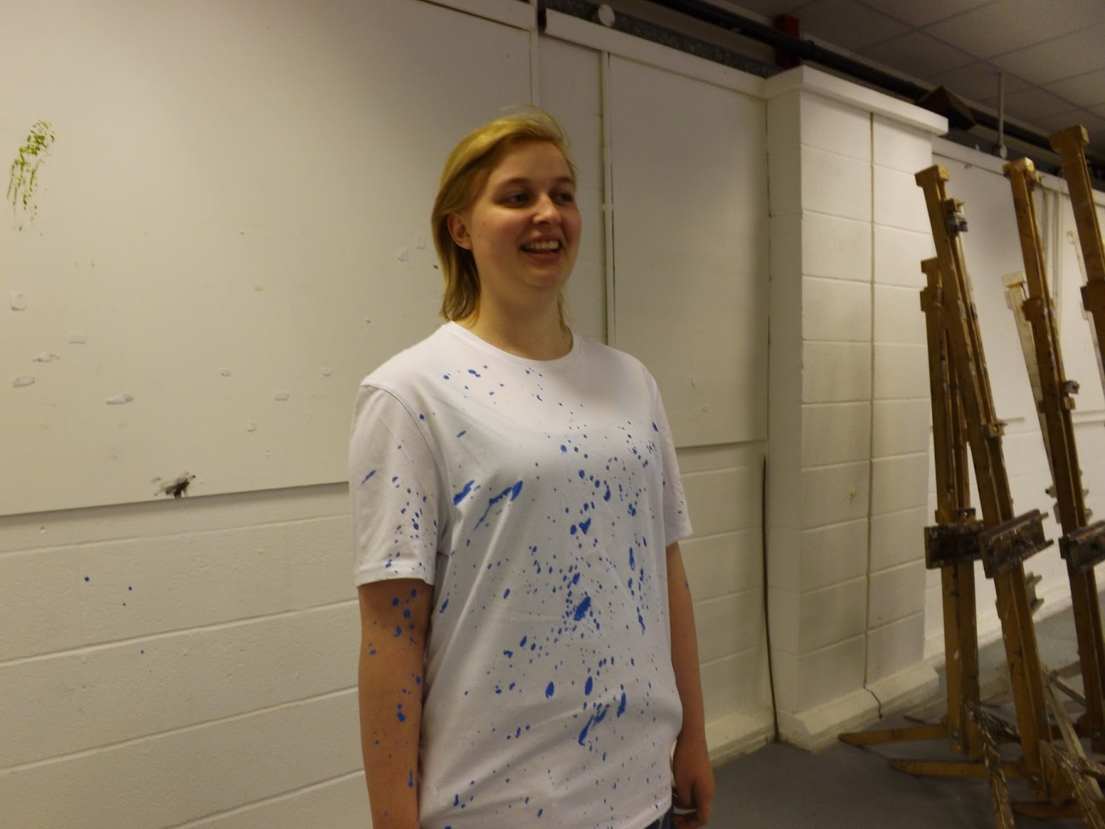
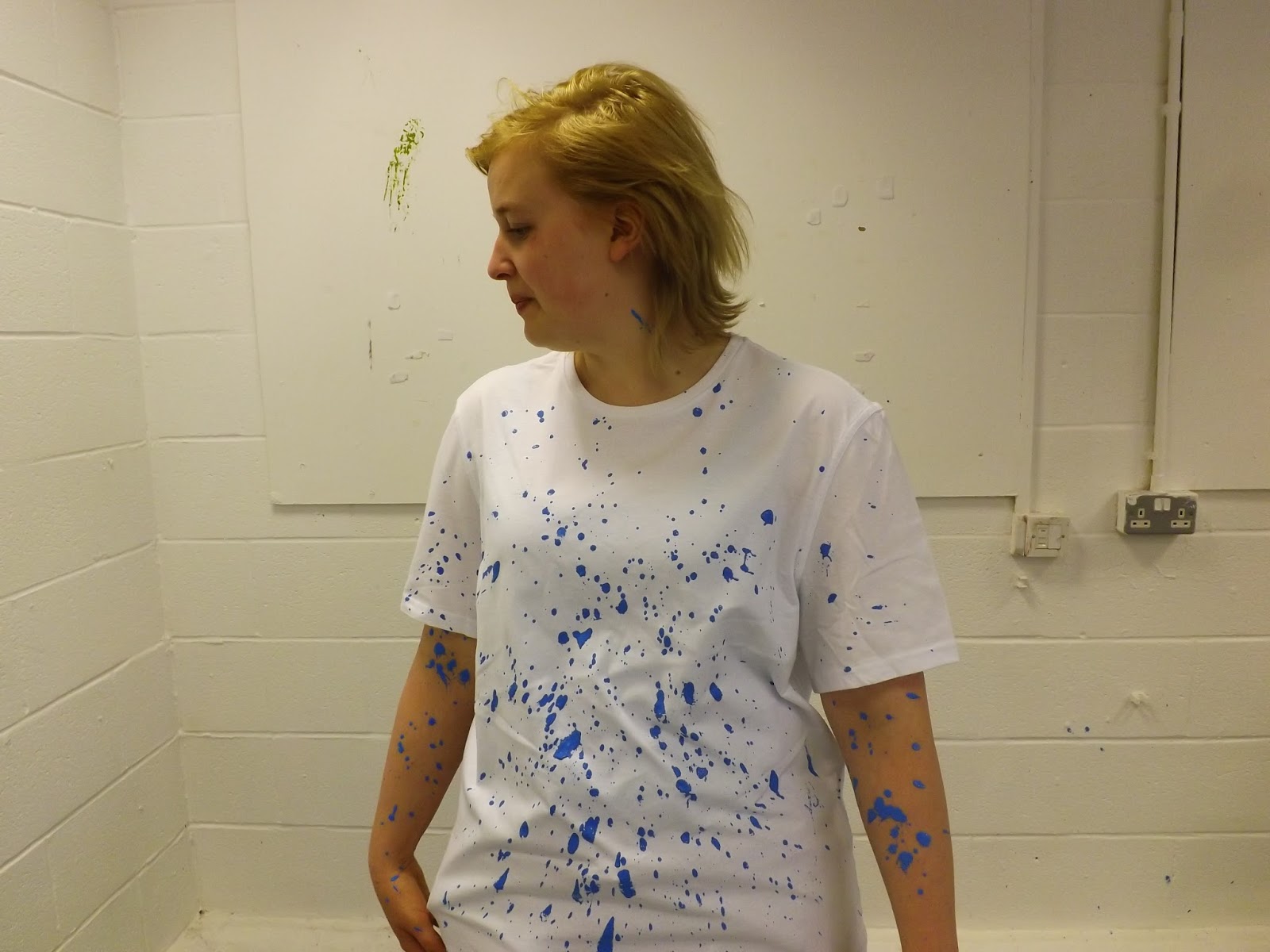
As my final project idea is based on Roy Lichtenstein dots and paint splatters. I thought it would be fun for the people viewing the exhibition to have a go themselves to splat on the walls, to make their own art.
With my splatted shirts I did added onto display.

This was where I looked back at it and thought back to my idea of creating 3 dimension dots.
I got a long piece of foam board, plenty of little pins and cotton buds, cutting them all in half and slotting them in the pins place in the board, so looking directly in front of them creates an effect of 3D ben-day dots.


So finally the T shirt came, and unfortunately not what I intended on firstly as I would have preferred the image to be slightly bigger/stretched and it ends at an awkward place on the body.


Even though I wanted it to be a t shirt dress so bad I just knew the image wasn't right for a t shirt dress, unless it was enlarged maybe.


So I messed around with it a little and decided to make it into a cemi crop top tee.This balanced out the image and made the tee look ten times better. 


Thursday 18 June 2015

Final Design


So now that i have changed the image around i now love it myself.
The colours are better,more vibrant and cool.
Clothing wear for surfers,lively fun teens,artists. I got feedback off my friends and family and who they think would wear it, Surfers and artists was the most popular.
Its got more of a cool vibe to it with the contrast of the colours.It works better than a pale blue and 
pink colour, which did infact make me think after a while it was more towards chilish baby colours when i cant and dont want that if it should succeed for my target audience.


Tuesday 16 June 2015

Working through new designs..

sticking with the fab image of eleanor i got in action..
reassuring myself of the bold bright colours i want and the target audience for the designs I've come to this..


Still needs work but its getting there!


POPCULT


In the old edited photo there was some creamy yellow lurking around the image so i went on selective colour,selected white and took out all the unwanted colours and it looked much better..


This picture i got from the photoshoot is just what i wanted and imagined.An awesome action shot of paint splattered on eleanor wearing a white tee.I personally picked the colours light blue,black and there was yellow but this was before we splattered the yellow on to it i just couldn't resist not using this photo.When i say 'we' by the way,i got my college friends to help and have fun splatting eleanor :)

After editing it looked even better,rather than having just an image id made on illustrator i now have something real,effective to put in my illustrator designs..so i went on to add some light blue dots to contrast with the blue on the image and lowered the opacity and i loved it..
then adding the logo in the bottom left corner just made it look that little more professional and bold.


after looking through my designs and reassessing who it is for,what my target audience is it didn't really work for me.
I like the designs but this last one is pixelated.I need to reevaluate if i want it to look pixelated or not so i can make it more obvious and out there.


popcultlogo

okay so i wanted something different,out there,something that popped and looked fun!!!
this is something i came up with my for my logo..


Im not too sure on whether to put in colour or keep it simple and black because if i go with colour i will feel i have to stick with those exact colours when i want to explore my ideas more with different colours..

If i want my logo to stand out and be creative and powerful i need to be less bland.Im going to take the black out completely and bring out more colour.


photoshopeleanor

This is the tshirt design i created with powder paint. It looked amazing when i first did it and got these awesome pictures but as its powder paint it just rubbed off after a while which is a little shit but i am happy i tried it and got some good shots from it anyway and worked really well as a litchtenstein inspired piece.
After editing the pictures and looking at them i love how it looks almost out of this world. SPACE. First man to walk on the moon was in the sixties...


photoshopeleanor 1


After changing the levels and curves to get the brightness on point,i then rearranged the selective colour and made the hair pink and more vibrant but subtle.

Tshirt Splatter

So i was thinking of different ways to create the roy litchtenstein dots, and i started to try splatting paint onto paper,splitting around stencils id made and what not. As I'm doing tshirt designs i thought it would be interesting to try out splatting paint onto the actual tshirt and on to people whilst wearing the tshirt and get some action shots. To try and bring some life into my fmp and a bit of fun to get this going.


Not looking very happy at all...(trying to be model-like i guess)


Powder Paint time...


Cameron being a doll wafting eleanor..